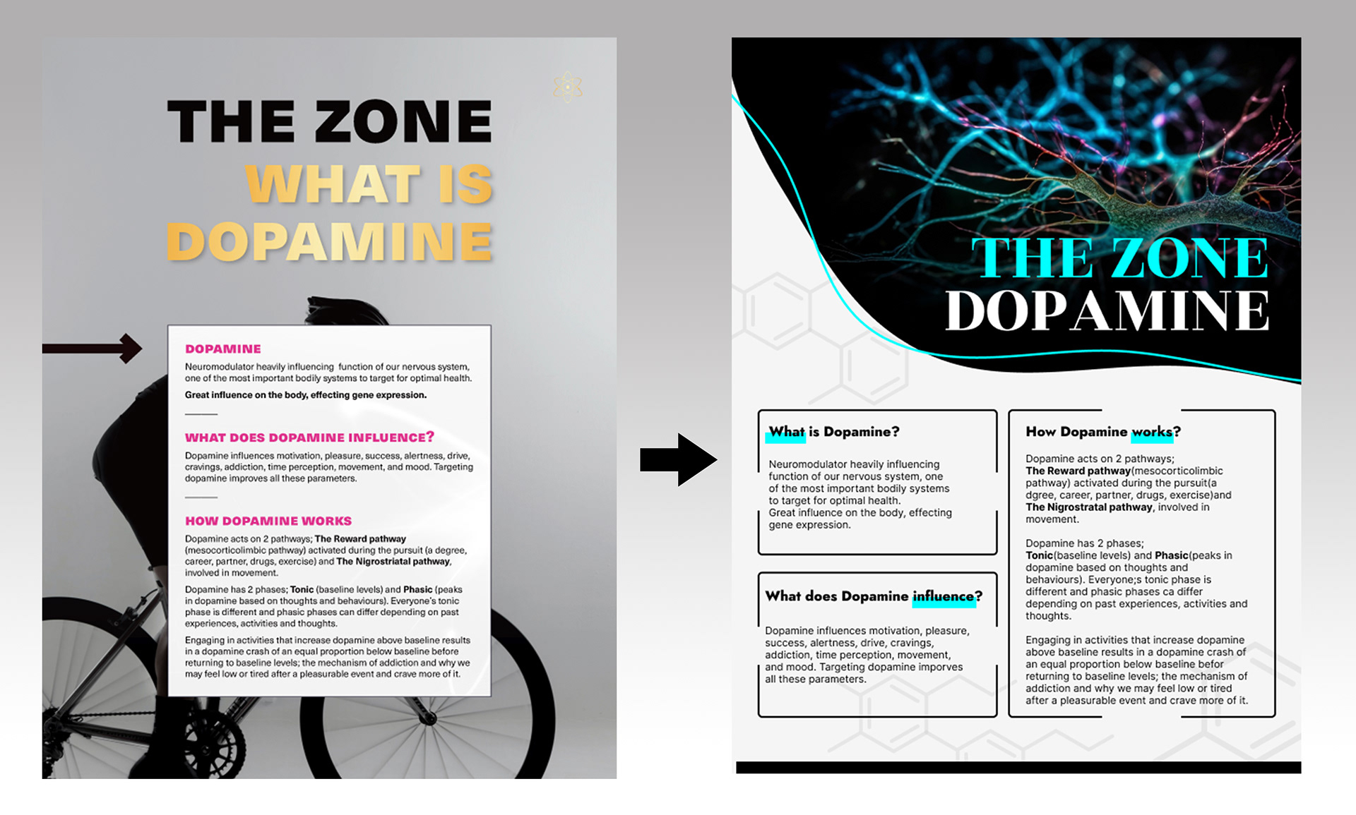
The original information flyer was informative but lacked visual appeal. It failed to capture the attention of the target audience effectively. In response to this, I embarked on a redesign project to create a more engaging and organized flyer.
The primary goal of this redesign was to make the information more visually appealing, improve readability, and create a design that would resonate with the target audience.
The primary goal of this redesign was to make the information more visually appealing, improve readability, and create a design that would resonate with the target audience.
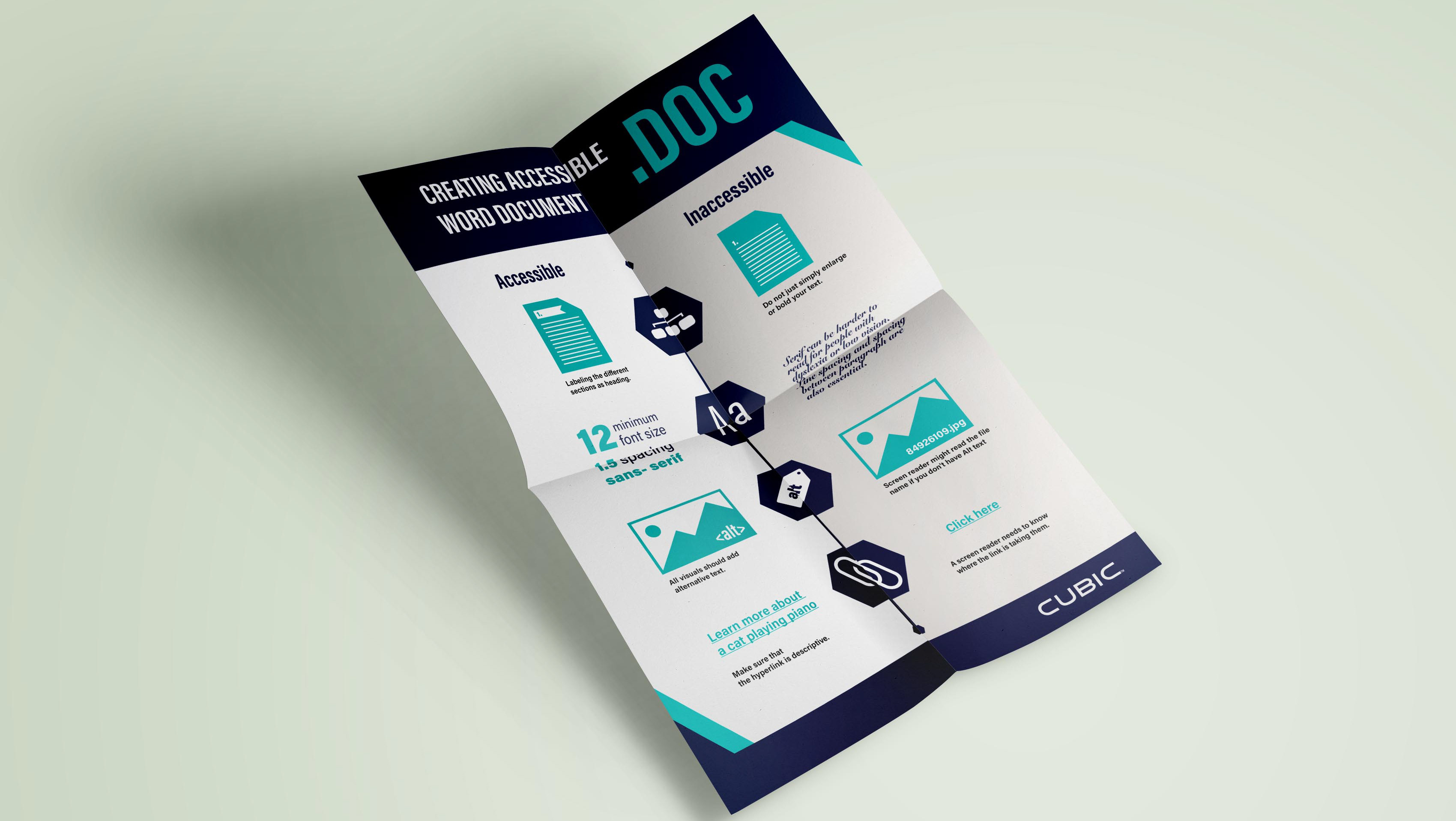
I opted for a vibrant colour scheme using bold and contrasting colours. The choice of colours, such as vivid blues and black monotone, was deliberate to evoke a sense of excitement and draw attention to key information.
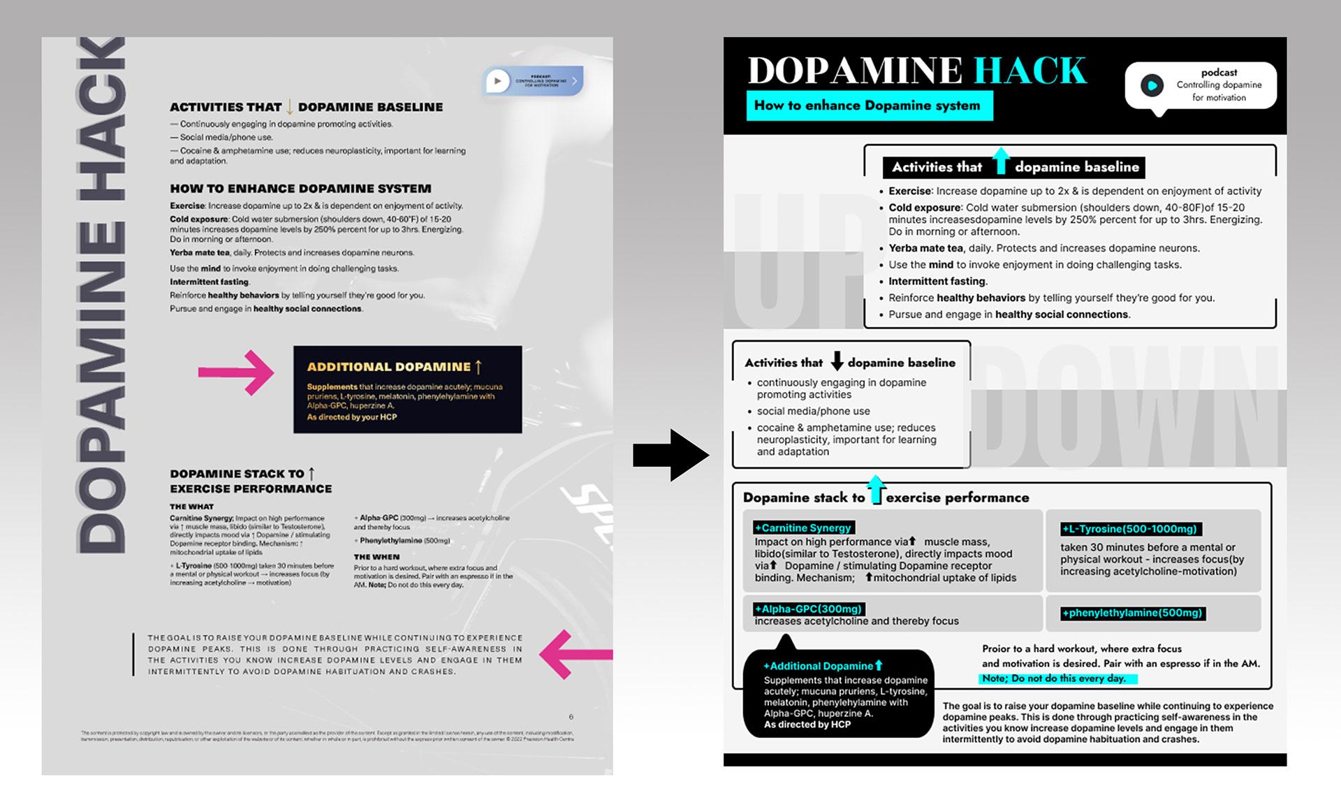
To achieve a pop-up style, I reorganized the layout with the use of dynamic diagonal lines and creative layering. This layout not only added a sense of depth but also made the content appear as if it were jumping off the page.
I introduced clear section headings to guide the reader's eye and make it easy to locate specific information. Bullet points and numbered lists were used for clarity.
One of the main challenges was maintaining a balance between the playful pop-up style and ensuring that the flyer remained professional and informative.
This redesign project successfully transformed a mundane information flyer into a visually appealing, organized, and engaging piece. The use of vibrant colours, creative layout, and thoughtful design choices achieved the objectives set forth, ultimately enhancing the flyer's impact.